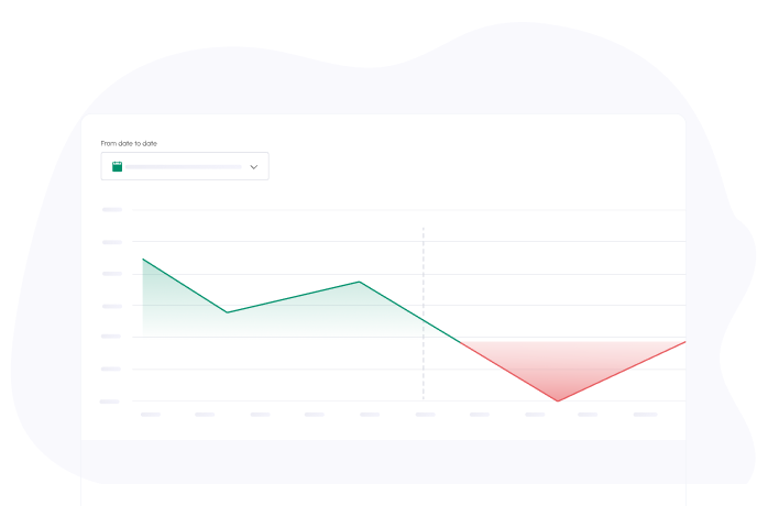
Exciting news! We have just introduced new tooltips for our cash flow graphs and charts to enhance your experience and provide you with precise information at any given moment. These tooltips are a crucial component of any cash flow graph.
Each graph features a unique tooltip. For instance, the Cash Balance graph tooltip displays the actual or expected cash balance for the specific date you are hovering over:
Meanwhile, the Monthly graph tooltip showcases the actual or expected cash-in, cash-out, monthly total, and cash balance amounts:
Lastly, the Cash in/out pie charts tooltip reveals the total amount per type for the selected time period:

